
The San Francisco Giants and Nike have officially released the “City Connect” jerseys for the Giants, and…well…I don’t like them.
“City Connect” is a series of jerseys that Nike proclaims will “guide one of the most historic visual connections in sports: the bond between baseball club identities and their fans.” Nike goes on to further say “The designs continue to explore a franchise’s connection to its city and its fanbase, each with distinct personalities, values, customs and traditions.”
And so, in such a dynamic and history-laden city as San Francisco, in a region that has shaped progressive values and technological achievements like few others…they picked fog and the single most photographed landmark to do that.
<Insert cringy facepalm emoji, which needs to be created just for this>
Perhaps Nike thinks the technology innovation is led by their use of gradients throughout the uniform, which was groundbreaking in 1997.
The problem with these uniforms is that they are so thoroughly bad, or just plain incorrect, from start to finish. So let’s count the ways.
The Colors
The color problems need to be broken down into three parts.
Fog is not White
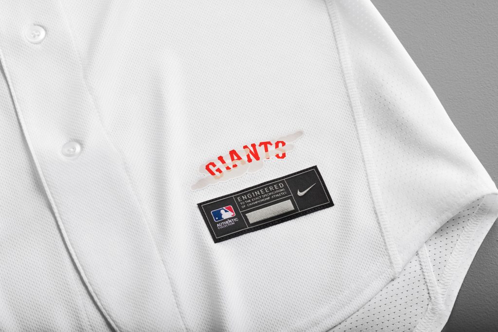
This is the single most obvious problem here, and it’s blindingly obvious because these jerseys are so blindingly white.
Anyone who has ever lived in San Francisco, or anywhere with fog, will tell you that the color you get from fog is not white. It’s grey. Fog may look white-ish from above, but that’s usually more sun glare. From below, where we live and experience it, the fog always is undoubtedly grey.
That is the heart of the conflict about this jersey, because they couldn’t obviously do grey for a jersey worn at home, right?
Wait, what am I saying? This is Nike? They don’t give a flying fornication about traditional color usage. They singlehandedly helped the NBA dump the idea of the “home team wears white” tradition that’s been the norm in sports for years (though the NHL did it first). Are you telling me, they aren’t brave enough to try that?
The Wrong Shade of Orange
The Giants wear orange. The Golden Gate Bridge is a different, darker orange (that rusts to red).
Neither orange is Nike orange.
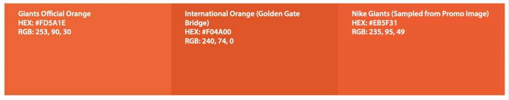
Pulling an actual orange from Nike is hard, because they do appear to be using a true gradient, but the effect of the orange is that it is a bright creamsicle orange, which feels like a neon-ization similar to the Oregon Ducks or Boise State Broncos, which isn’t a good thing.
This pulls away from the branding of the Giants as a team, and the intended effect of evoking the Golden Gate Bridge, supposedly one of the goals of this design. Especially being topped by an all orange hat only makes it feel brighter, which only pulls it further away from connecting with the fans, and looking just worse on the field.
The Lack of Black
The Giants branding is black and orange, dating back to the New York days, though not all the way back. One might suggest that black has been the more prominent color, judging by the color of most team-used jackets, and the longtime color of the hats. Orange has been used more as a highlight color, in some ways. But the truth is, the use of black has been what makes the orange pop more, it’s what helps the orange work, feeling bright without actually being neon.
That is why this neon orange feels even worse, because there’s no black on this uniform, anywhere. Unless they wear black cleats, maybe. Even the belts are orange. And the orange on white makes what should be a similar orange feel more like a creamsicle, not having the contrast.
But it’s not just the lack of black. There is no secondary color at all. White is not a secondary color. There’s no gold. There’s no brown. There’s no blue. There’s just….nothing. The orange is a highlight color to nothing at all, and that just makes for a worse effect.
The “Gradients”
That brings us to Nike’s blending of the white and orange. Taking away the color problems, the gradient could work. There’s an idea here that I honestly get. The “G” rising over the fog, because, you know, it’s big. Giant, even.
But in practice, it just doesn’t work that well. Gradients have been a longtime graphic design rage that has become a cliche in all sorts of things, including sports graphics, and that is a problem. Even with having a proper intent and reason behind it, it still feels like a cliche.
From a distance, it looks better. But the closer you get, the worse it looks, especially the implementation of it. Because it’s not a color gradient, it’s more of a dithering, a pixel replacement rather than different colors.
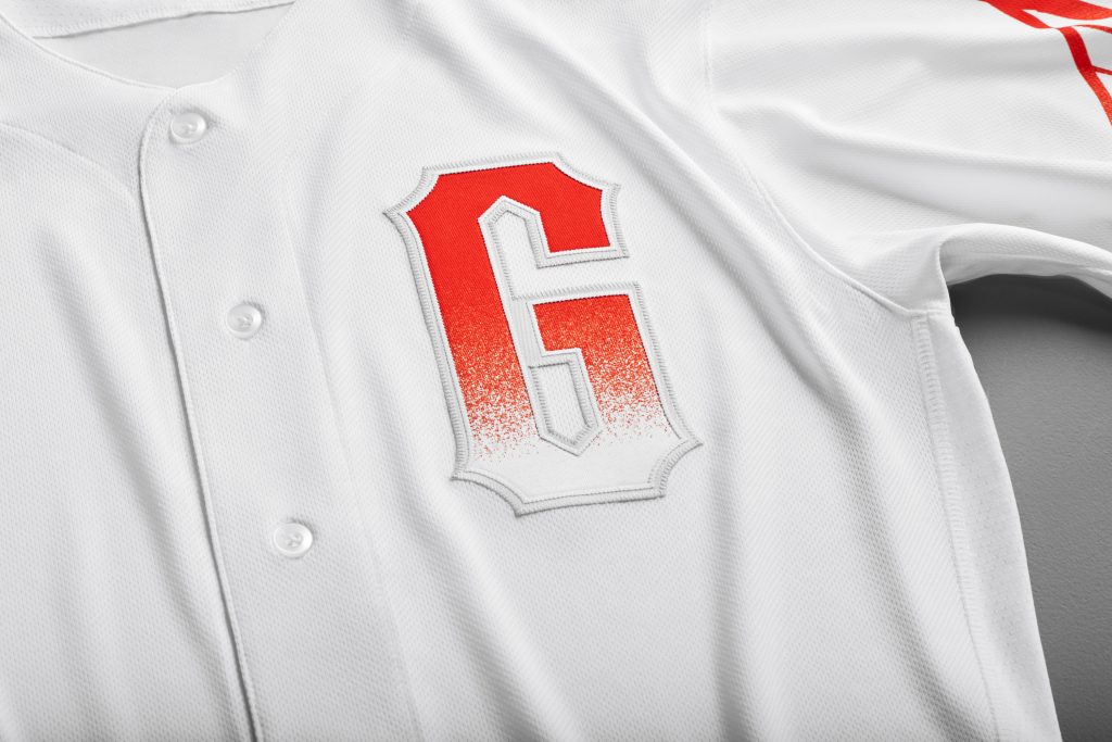
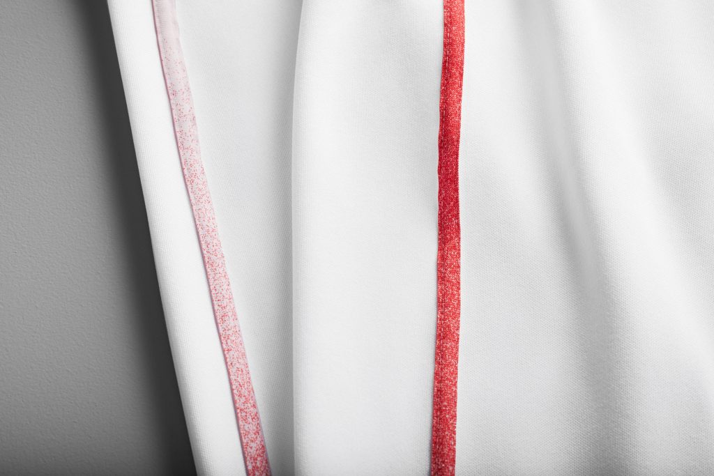
This dithering is not just present on the graphics and numbers, but it’s also on the piping of the pants.
This is not what fog looks like, up close or otherwise. It makes the whole thing look even more manufactured, and looks closer to the pixellated multi-scale camouflage used by the military (and San Diego Padres) than anything natural and organic.
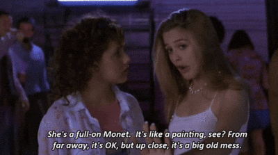
From a distance, I could almost get behind this idea. But as a jersey we’ll see up close (especially anyone who wants to buy it), this becomes a Monet failure as best described by Cher from Clueless.
The Use of the Bridge
I love the Golden Gate Bridge, I really do. Coming home from Oregon recently, I was excited to drive across it, lit up at night.
But it is such an obvious choice.
San Francisco has a few iconic buildings. It has two major bridges, and you should also think of the Lefty O’Doul bridge sitting next to the ballpark, from its baseball name connection to the fact it was featured in a James Bond film. There’s cable cars (which are a bit cliche as well). But there’s also the many cultures that call the city home. There’s the history from the gold rush to the 1960’s flower power, from being home to one of America’s largest Chinatowns to being one of the most iconic and welcoming LGBTQ communities in the world. There’s the educational influences of the area at Berkeley and Stanford to the technological influences of the entire area that have literally changed the world.
But they went with the Golden Gate Bridge.
This is something that is so disappointing. I’ve been dreading Nike’s jerseys since they were announced, but I was hoping they’d go for something revolutionary. To try and do something else. I was hoping they’d at least go for a risk, but it went the other way.
The take on the bridge isn’t even revolutionary. It’s basically the same idea as the sleeve patch introduced in 2015, just extended beyond the boundaries of a patch. It is very cool that the bridge cables go around the entire sleeve, almost teasing a pinstriping effect that is very not-Giant but that didn’t look bad. But an angled view might’ve been at least slightly different, and could’ve still kept that wrap-around look.
Using the bridge isn’t bad. It’s just so uninspired.
The Use of the Fog
Okay, the fog is a different take, and I think I should like it. But it goes against this whole suppsoed message of culture and identity. Take a listen to the hype video that Nike and the Giants made:
“Think fog? Chilly summers? Look closer; there’s way more to us than meets the eye.”
“We’re more than just postcards, we’re portraits.”
“We paint the town in every color.”
“We are life turned up to 11.”
“Beneath the fog, we are golden.
And what do they do on the jersey? They blank it all out with fog and the postcard bridge, and use just one color.
Nice branding, Nike. Seriously.
(And note the last shot of the video, using the angled version of the bridge.)
The Hat
Again, pretty uninspired. I worked in the Giants Dugout Store in college, from 1998-2001. During that time, the team had “Fashion color hats”, basically the same SF logo and hat with other bright colors, including red, green, and a light sky blue. This hat, its brighter color, reminds me especially of that sky blue version. It’s not necessarily bad, again. But it does not feel special.
What takes it down a bit is that side panel with the bridge. The edges coming up cropped just feels off with one of the jersey’s better concepts, the cables wrapping around the entire sleeve. I know there’s probably technical limitations theres, and the cap is made by New Era rather than Nike, but it’s just one more weird thing. But heck, at least it’s better than New Era’s “Local Market” hats.
The Font
The pointed font of the G isn’t a bad inclusion. In the past, the Giants have more often used the script G used in the cursive font used since the 1940’s, but incorporating the spiked G allows for a slightly newer feel without going revolutionary. The team did adjust it, making it taller and skinnier, again to evoke the Golden Gate Bridge towers.
The font feels a bit more off with the numbers, and it’s the one part of the jersey that I’m back and forth on. The block numbers the Giants have used for decades are pretty standard, and fit the bill nicely for what they need to be: legible from a distance. Adding the dithering effect to the numbers takes away from the legibility, and I wonder if adding the spiky effect to the numbers will only hurt it further. But perhaps without the dithering effect, I’d like it enough to include on the regular uniforms.
The “Jock Tag”
The Jock Tag on these City Connect jerseys is one of the only things I really like…or at least I liked more, until it was made clear to me that the fog that is obscuring the “Giants” name is in the form of an SF.
I still don’t hate it. The fog on here is more natural than the dithering effect of the fog in other parts of this jersey, and even with the cheesy initials as a part of it, these feels more like what they were going for with this idea.
The jock tag is one of the more inspired ideas on this jersey. But it’s hidden, of course.
The Final Words
I figured I wouldn’t like the Nike City Connect uniforms from the moment the whole thing was announced. I’m a stodgy traditionalist in some ways, though probably not enough so to actually be a traditionalist, and I figured that Nike would do something I wouldn’t like. But you know what I didn’t expect to feel from these jerseys?
Underwhelmed.
I expect Nike to make their mark in big ways making changes, and that’s been consistent across the other City Connect jerseys. If they’re going to fail, they’ll fail big, like taking the red completely out of the Red Sox by changing the colors, even with a point of Patriot’s Day.
Instead, these jerseys feel blank. It’s a lot of blank white space. It’s a simple gimmick. But it’s mostly uninspired, uncreative.
City Connect is supposed to “Explore the bond among Baseball, Community, and Culture.” Can you honestly tell me that any of that was accomplished by these jerseys?
I expected more.
These jerseys aren’t just a swing and a miss. They’re a check swing that went a little too far, and couldn’t be held back until the jersey design teams of Nike and the Giants could take a real, truly meaningful swing.

Recent Comments